How to Make a Great First Impression with User Onboarding
A Streamlined Guide
Welcome to Makers. I’m Josh, the founder of Orbit, and every week I simplify and share practical design advice on taking ideas from zero to one.
Onboarding is more than just a sign-up process. It's the initial guide and a memorable first moment with your product. This isn't about creating a one-time interaction; it's about igniting a lasting relationship.
When users' needs are met, they aren't just choosing a tool. They're inviting your product into their daily routines, seeking to elevate their personal or professional efficiency.
The challenge isn't just convincing them of your product's potential, but also quickly and consistently showcasing its tangible benefits, and surpassing their expectations over time.
Why is onboarding important?
Today, there are a lot of SaaS apps competing in the same product space. This makes it easy for users to compare and switch to a different one. If you find that users are either struggling to sign up, or they leave shortly after trying out your product, it's likely they haven't experienced its value and aren’t convinced that it’s the tool for them.
The goal is to quickly guide users from introduction to that 'Aha!' moment, where they understand your product and are convinced it's the right tool for their needs.
While there's no one-size-fits-all strategy, we can review the stages of onboarding and explore methods that take your product's initial impression into a lasting impact. Together, we'll ensure that your solution not only resonates with potential users but also showcases its worth effectively, enabling them to fully experience its benefits.
Firstly, define your users ‘Aha!'
What does success look like for your users? When do they truly experience the value your product offers for the very first time? Answering these questions will not only help you create an onboarding process that directs users toward this goal but also assist in identifying ways to improve their journey to that 'Aha!' moment.
Examples:
For a consumer nutrition app, a user's first success might be when they log their meal.
In the case of a B2B climate-tech SaaS, the first success could be the completion of the initial customer integration.
For a productivity screen-recorder SaaS tool, maybe the 'Aha!' moment occurs when users download the tool and realise how easy it was to record their first minute.
The 3 stages of onboarding
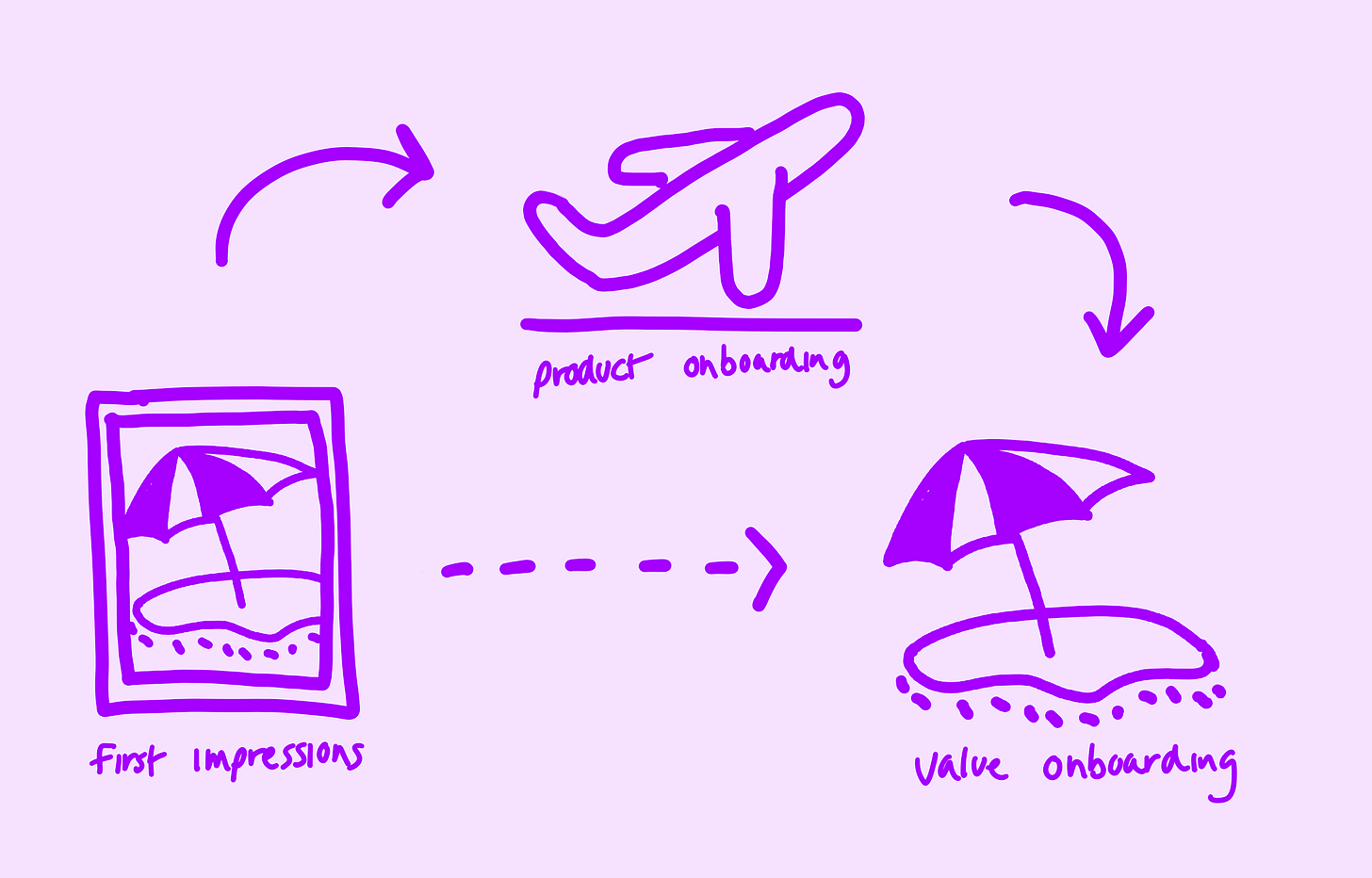
Think of the overall onboarding experience like planning a vacation:
First Impressions: Imagine you're searching for your next holiday spot. You see a photo of a beautiful place and think, "I want to go there!". That's like a user seeing your product for the first time and sparking their interest.
Product onboarding: Once you've picked a place, you book your flight and hotel. That's like a user deciding to try out your product, by signing up to see what it's all about.
Value onboarding: Now you've arrived and you're checking if the place is as good as the photos. In the same way, users check if your product lives up to its original promises from the first impressions, and if it really helps them or not.
Stage 1 - First impressions 🖼️
Let’s walk through some examples:
Example 1 - Equals.com

✅ Clear problem statement: Concisely explains the problem they're addressing. However, using a word like 'any' could be made more specific. Their sub-line effectively highlights the top features, indicating why their solution is the best.
✅ Clear call to action: Comes with an enticing offer. The low friction, "try for free" language reduces the friction to try it.
✅ Unique design: The fun, modern design stands out. The instant product preview provides a comprehensive understanding of the product’s functionality and benefits.
Example 2 - Bento.me

✅ Design & solution clarity: The design is clean and straightforward, paired with a very specific product explanation. The mention of "link in bio" instantly clarifies its use, and the unique selling point stands out, enhancing the perception of quality.
✅ Effective call to action: The call to action is straightforward and uses engaging, personalised language, making it inviting.
✅ Quick product overview: As users scroll, they quickly encounter the product and its standout features, reinforcing the promise made at the beginning of the page.
Tip 1 - Clearly communicate your solution ✨
Create an inspiring intro: Explain your product's promise using both text and visuals. Aim for high-quality. Remember, while some products can thrive despite subpar design, a polished appearance can boost trust and engagement.
Speak their language: Tailor your content to resonate with your target audience. Understand the terminologies, pain points, and desires they relate to.
Define the problem, for whom, and when: Be explicit. For instance, "Helping freelancers manage their finances when starting a business."
Inspire action: Motivate users to take the next step, whether it's signing up, purchasing, or exploring further.
Tip 2 - Elevate the perceived quality ✨
“Ultimately, what determines whether users will engage with your site is their assessment of the site’s expected utility: perceived value vs. the perceived cost of interacting with the site. According to the information-foraging theory, people behave on the web like animals in the wild: they assess the perceived value of a new foraging patch against the perceived cost (effort) of obtaining that food.”
- Aurora Harley, Nelson Norman Group
Simplicity is key: Many UI issues faced by early-stage founders arise from over-complicating things. Keep your design and messaging straightforward and clean. Get rid of unnecessary elements. Look to successful products for inspiration on streamlined, efficient design. Go to Mobbin for examples.
Engage with the right tone: The way you communicate with users significantly impacts their perception. Ensure your tone matches what they expect. Whether that’s friendly, genuine, or helpful.
Stay updated: Regularly assess and update your design to ensure it remains fresh, relevant, and modern.
Tip 3 - Make the next action obvious ✨
Guided prompt: Clearly indicate what the next step is and how users can take action. A button should be unmistakable and inviting.
Immediate direction: Users should know, without a doubt, where to go to get started. Prioritise your actions correctly. Highlight your primary action with a standout button, avoiding multiple buttons with the same function which can scatter focus. Ensure this button contrasts well with the page's design, drawing attention second only to your headline.
Stage 2 - Product Onboarding 🛫
Let’s walk through some examples:
Example 1 - Mint (Video)
✏️ Consistency & aesthetics: The onboarding process has a disjointed feel due to the contrasting design of the 'Intuit' and ‘Mint’ sections. This can weaken user trust in the product's quality.
✅ User-centric approach in Mint section: The second section uses a simple and beautiful design which is pleasant to use. They understand the goals of the users who are coming to this app well, by asking what the app can help them with. Whilst it’s an extra question in the process, it’s a meaningful one. It can make users a little more confident that this is the tool for them.
✅ Clear next steps: Mint highlights the primary action users need to take at the end of the flow – linking a bank account. Clear cues like this streamline the onboarding experience, guiding users to their next step effortlessly.
Example 2 - OpenPhone (Video)
✅ Design excellence: The onboarding experience is presented in a modern, attractive, and straightforward manner, which sets a positive tone for the experience.
✅ User focus & clarity: Throughout the onboarding, there's a clear emphasis on minimising cognitive load. With a design that makes users focus on one question at a time, the experience feels intuitive and undistracted.
✏️ Commitment hesitation: Requiring users to choose a plan before exploring the product can be off-putting. While not a total dealbreaker, this approach risks losing users who'd prefer to familiarise themselves with the platform before making any financial commitments. Offering an initial product tour or limited access might build user confidence and lead to more substantial commitments later on.
Example 3 - Mixpanel (Video)
✅ Efficient sign-up: The process from the homepage to accessing the product is quick and uncomplicated, making the onboarding experience smooth for users.
✅ Design quality: The modern design enhances the perception of the product's quality, setting a positive expectation right from the start.
✅ Strategic user journey: The onboarding sequence effectively guides users through initial set-up tasks like creating an organisation and the first project. This ensures that once users reach the dashboard, they're met with a sense of progress and achievement.
Tip 1 - Personalise their journey ✨
Tailored flow: Use essential questions that both pave the path to success and reaffirm the landing page's value promise. This can be in the form of setting specific goals or adapting the product experience to the user's needs.
Guided experience: Ensure users feel directed and supported at each step. This not only enhances user experience but strengthens their trust in your solution.
Tip 2 - Simplify to reduce friction ✨
Reduce steps: Every additional question is a potential barrier. Aim for a sign-up process that's efficient and gets users to the core product swiftly.
Immediate value: The focus should be on a fast transition into the product where users can instantly start experiencing its value.
Tip 3 - Collect essential data only ✨
Faster onboarding: Fewer steps equate to a faster and more direct experience. It's vital to ensure users can quickly delve into your product's functionalities.
Privacy by design: Embrace a privacy-first approach. Request only essential data and always be transparent about its usage. Avoid the pitfalls of excessive data collection practices like those seen with apps like Threads on iOS.
Stage 3 - Value onboarding 🏖
“If your onboarding only extends as far as the first minute or two within your app, it’s not only colliding with a TON of other competing information that users have to wrap their head around, it’s also abandoning those users long before they’re actually fully up and running (which can easily take days, if not weeks).”
- Samuel Hulick, UserOnboard.com
After the initial signup, the true test begins: delivering on the promise you made during first impressions. Think of 'value onboarding' as your chance to give users an demo of why they chose your tool over countless others.
While traditional onboarding may be about ushering users through the door, its significance decreases if users feel lost once inside. Your job extends beyond the welcome mat. If users find it challenging to experience the very benefits you promised, their journey with your product may be short-lived. Ensure the path to value is straightforward, intuitive, and fulfilling – or risk them heading for the exit.
Let’s walk through some examples:
Example 1 - Mixpanel

✅ Guided progress: The homepage effectively outlines the next steps, providing a clear view of tasks ahead.
✅ Intuitive navigation: Navigating the homepage is a breeze, with clean and straightforward options to move forward.
✅ Resources at hand: Quick-start guides and SDK examples are readily available. This not only supports exploration but also accelerates the learning curve, ensuring users can dive in with confidence.
Example 2 - Trello

✅ Guided paths forward: The product introduces itself with ready-to-use templates with different Trello board styles, drastically cutting down the learning time and letting users dive right in.
✅ Focused action: The primary button is geared towards achieving the initial success, guiding users to create their first board.
✏️ Navigation duplication: The side navigation seems a little distracting. It's unclear how it differentiates from the main navigation at the top.
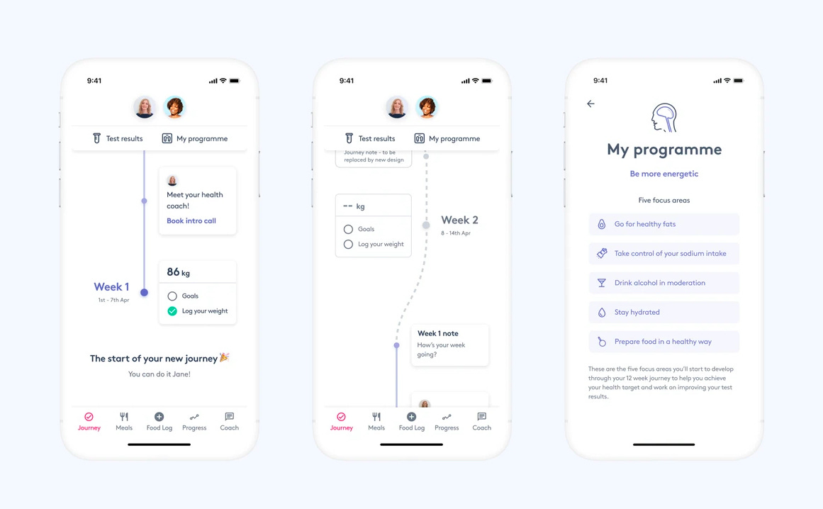
Example 3 - OME Health

✅ Progression system: The app effectively utilises a progression system to provide an engaging introduction. Presenting the health journey as a timeline gives users an immediate sense of progress.
✅ Guided experience: Users are directed and their expectations are set through a clear timeline design. This ensures they understand both their current status and future steps.
✅ Remarkable moment: The app focuses on creating a lasting impression, especially for first-time users embarking on a weight loss journey with language such as “The start of your new journey”.
Tip 1 - Guide users to make their first win ✨
For more advice on specific onboarding patterns such as improving empty states, I highly recommend diving through Samuel’s incredibly concise and useful website specialising in these patterns here.
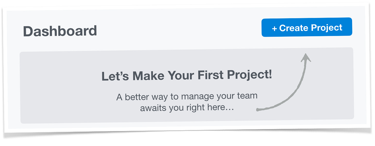
Remove roadblocks: While empty states can be used, they should guide users toward their next action. They shouldn't be left to figure out what to do on their own.
Progression systems: Utilise them to provide clarity on the user's journey within the product. They are helpful in showing the immediate next steps.
Simple first forward: No-one wants another to-do list. Ensure the experience is as straightforward as possible, even if it seems overly basic at times.
Tip 2 - Make it memorable ✨
Be engaging: Think about the difference in experience between a waiter who merely points to a table versus one who welcomes you warmly. The latter leaves a lasting impression.
Be Impactful: Ensure users feel this product is the solution they've been searching for without being obtrusive.
Tip 3 - Become their long-term coach ✨
Be empathic: Always try and approach the experience from their perspective. Think about a time you started using a new tool, what difficulties did you face getting up-to-speed in the learning process?
Clear direction: Users should never be left wondering "What's next?". Keep the journey intuitive.
Build & nurture the habit: Recognise that while users might take time to familiarise themselves fully, if they find value, they'll hopefully invest the time to form a habit. Regularly check in and evaluate if the solution meets their needs by speaking with them, refining the experience as needed.
Measure, refine, repeat.
Utilise analytics tools to refine your onboarding. Activation rate, time-to-value and retention will give you insights to spot weak points.
It's important to set up feedback loops, but timing is everything. Speak with users for feedback after they've received value from you. Imagine that you’re about to test drive a car, and the dealer asks how it is to drive before you’ve even sat in it? Of course, it doesn’t make sense and it’s off-putting.
Make it a habit to speak with users regularly. If possible, observe their interactions with your product. Questions about their initial experience can offer invaluable insights that will guide your decisions like a compass.
Summary of learnings
Onboarding is more than just a sign-up process: Beyond the first impression, ensure you have a clear and engaging flow that helps your users to see the magic of your product right from the start.
Keep it sweet & simple: Onboarding should feel like a breeze. Cut the extra steps, ask for just the essentials, and keep it clutter-free. Eliminate any unnecessary UI or information that could mentally overload users.
Lead them to the eureka moment: Guide your users to that 'Wow! I get it now!' moment. Help them see and feel the real value your product brings.
Always learn & improve: Feedback is a gift. Embrace it. Make your onboarding experience even better with each insight and suggestion. Offer users help when they're lost, celebrate their milestones, and always be ready to listen to their feedback.
All the best,
Josh (@joshuanewton1) 🔮
✨ I hope this week’s writing was useful for you. Sharing this article with your team allows me to continue being helpful and continue writing. If you want to reach out, you can tweet or email me as I’d love to hear from you.
🗓️ Next week’s article:
How to beat the competition, by design.


